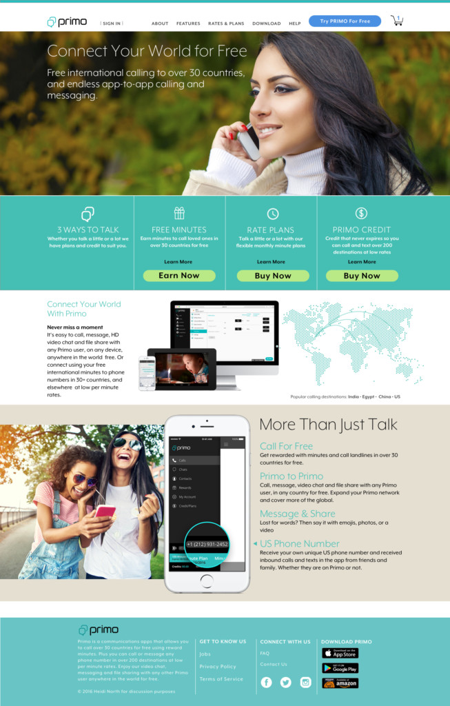
Visual design for a Mobile Communications and App company. I was asked to redesign the look of their website. I used the App Sketch to create the design. Their website was confusing and repetitive. The idea was to communicate their message clearly, to clean up the navigation and make it look better. Most of the customers are users from India and other countries who have family in the United States. See below for the before.
I created the Visual Design on the Grid System. It’s designed in 2X with Sketch for Retina Displays. It’s a responsive web site for Desktop, Tablet, and Mobile devices. I started the process by creating wire frames in Sketch. I also use Invision to show how the navigation works.
Above is the User Interface design for the Home page. I used the brightest colors for the call to actions.
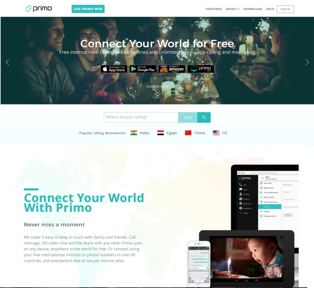
Before
Below is the web site before I redesigned it.


