
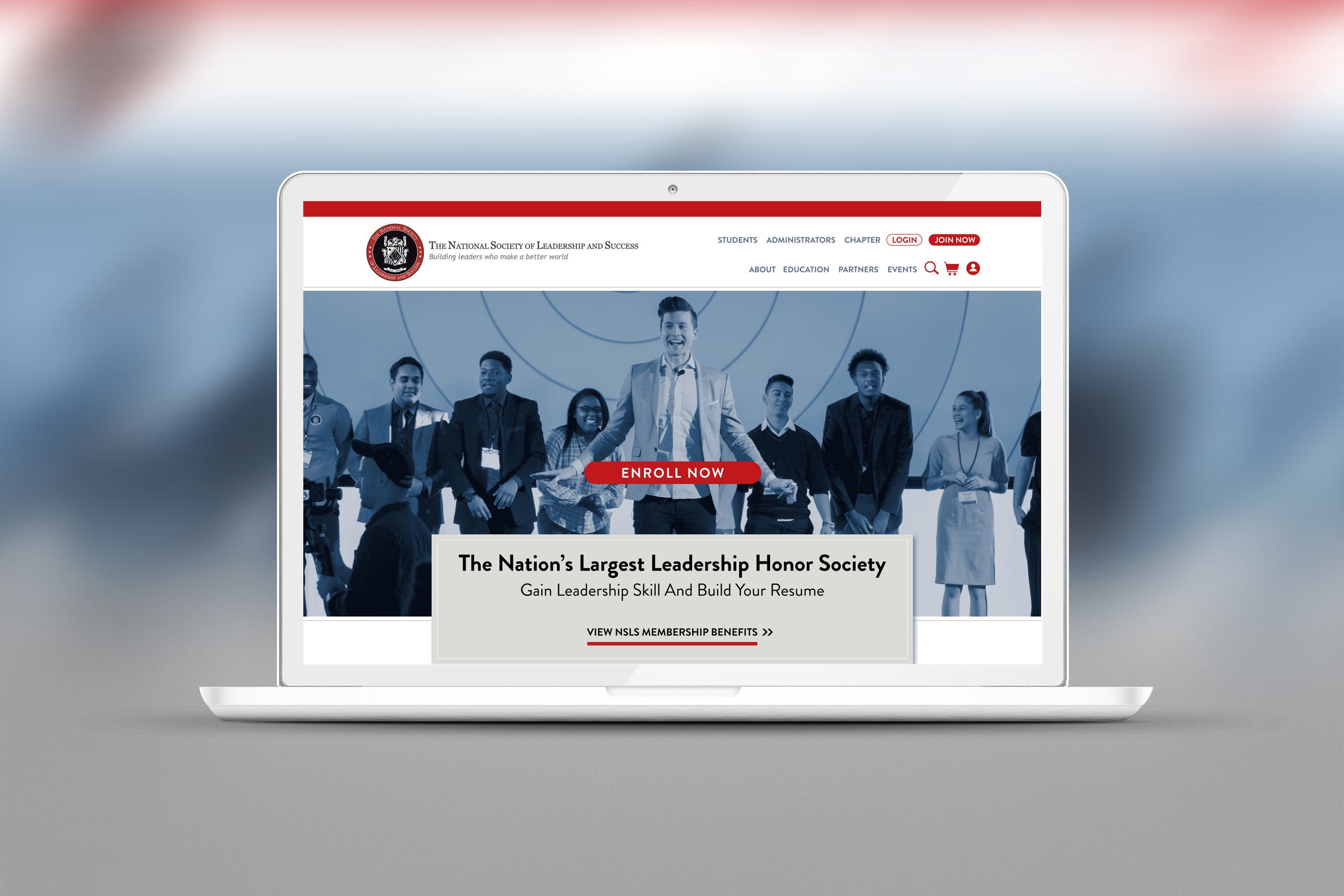
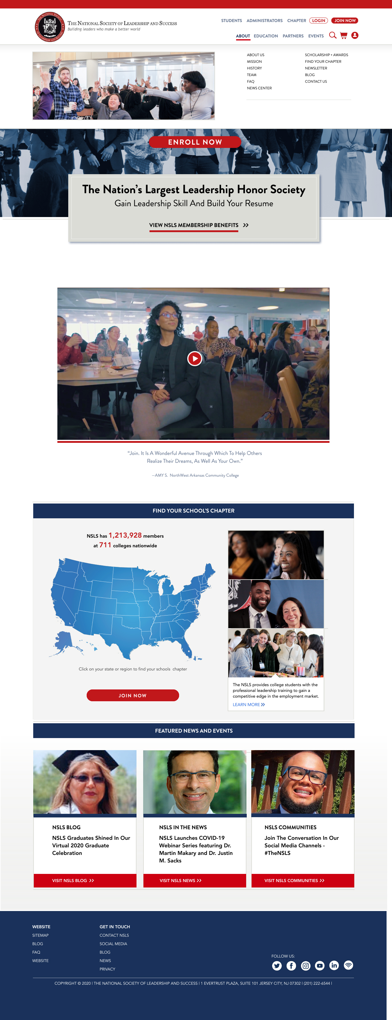
I was asked by NSLS to redesign their website and navigation. I was give their style guide and told to keep everything they had. The import part of the project was simplifying the user journey and experience. And to convert users into members. Watch the video below for the high fidelity prototype. This was designed in Figma. I used a drop down menu and multiple touch points to engage the user into joining. I simplified the Login and Join area. And simplified the map. I also added a sizzle real to make the page more exciting right away. And added a more robust footer. Their Before Image is also attached below the video.
WATCH THE VIDEO ABOVE: SEE THE FLYOUT MENU FOR THE STATES CHAPTERS.
Below shows a rollover state with sizzle reel, prominent buttons. Way-finding in the nav area so the user will know where they are at all times on the website.
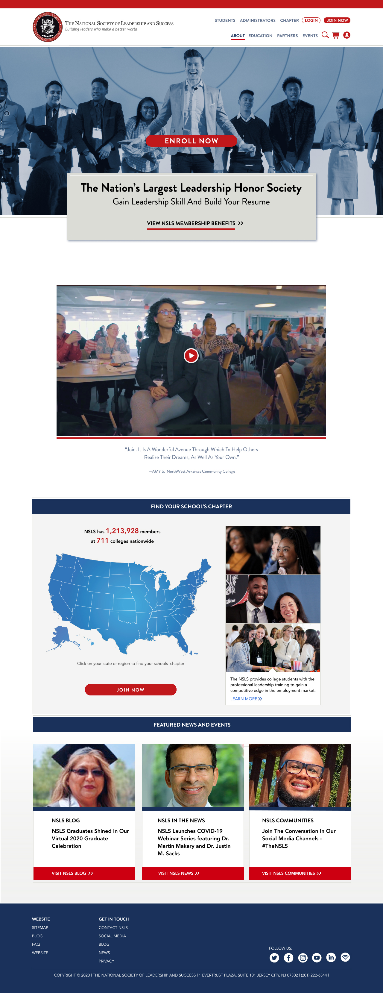
The Map area has a rollover on the state. When you click it a pop-up menu shows up which is in the video.

This version has a pop-down menu in the Nav area which covers all of their submenu / category items.
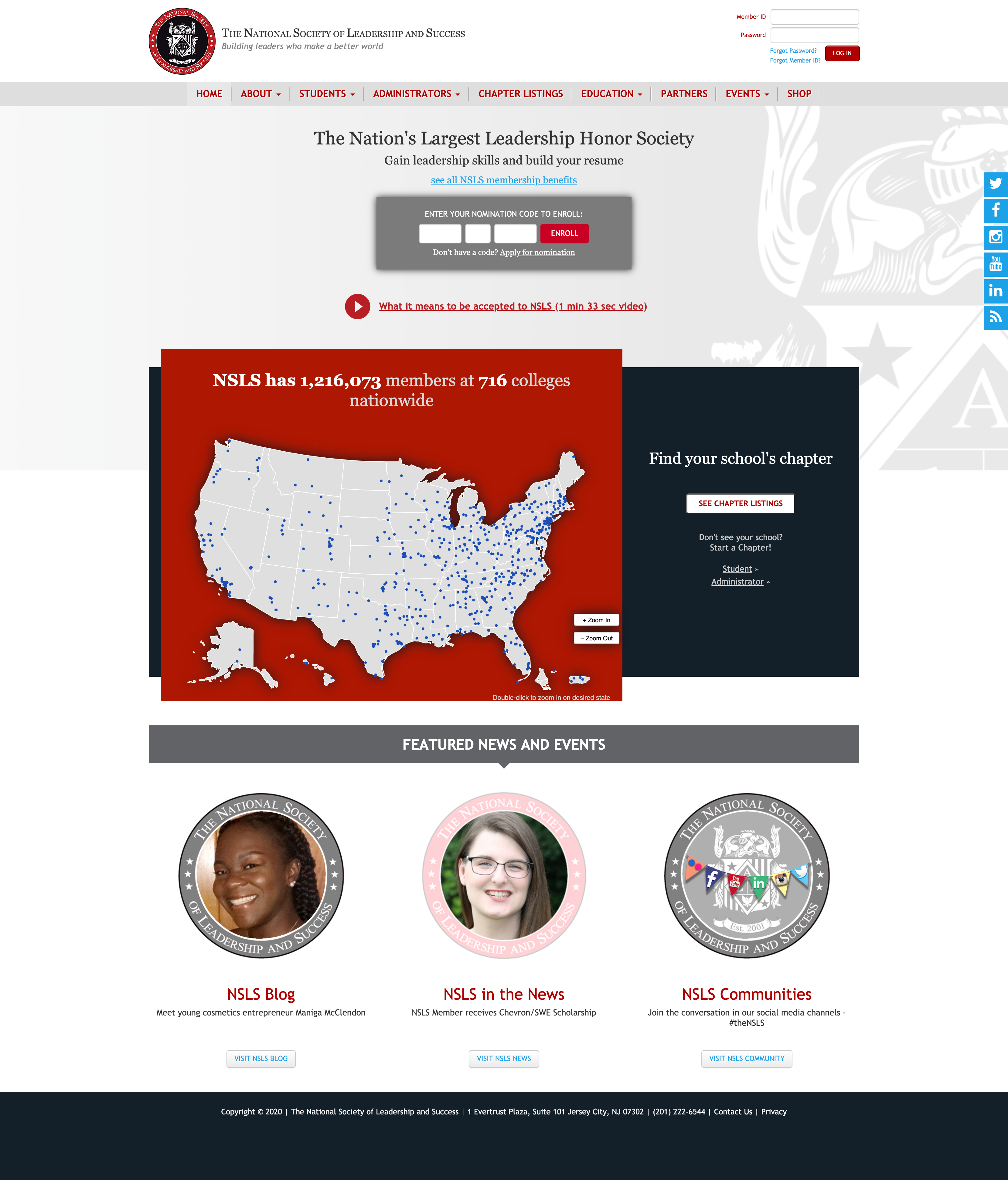
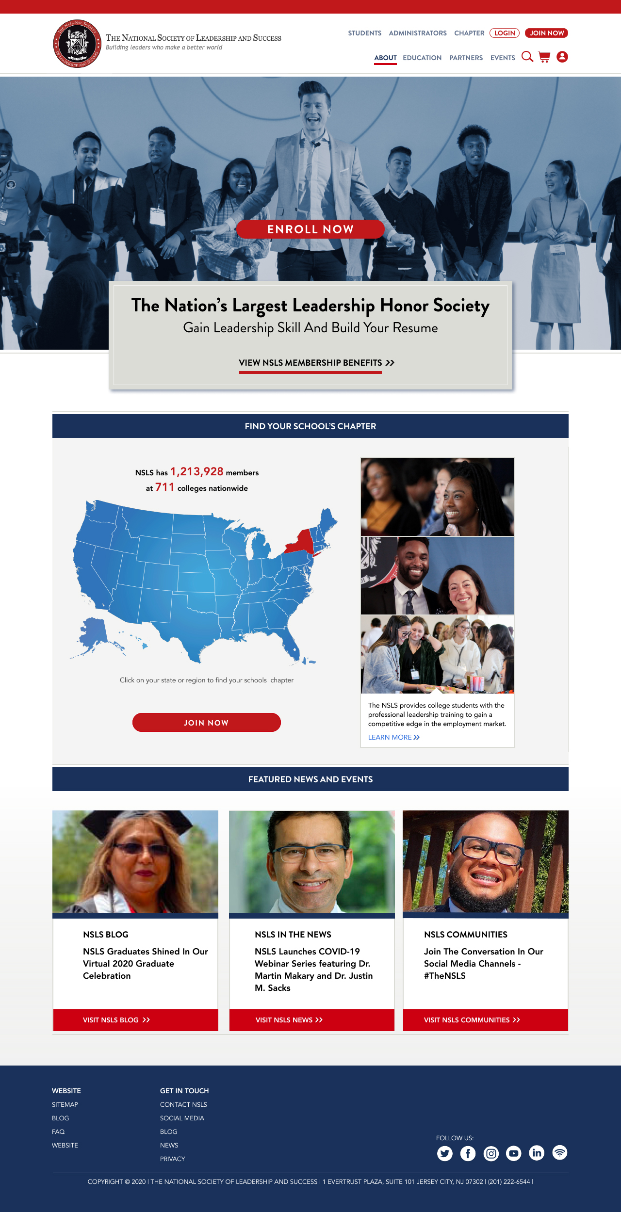
BEFORE REDESIGN:
This was the the NSLS website before I was asked to redesign it.

